Tiny Screens and Giant Magnifying Glasses
This might be one of my favorite designs in film. It’s a monitor from Terry Gilliam’s 1985 dystopian film Brazil.
Screengrab from this delightful scene, as uploaded to YouTube by Manzu.
On the left of this frame, there’s a somewhat reasonably sized (if distorted) black and white image. On the right, the peculiar mechanism of these monitors becomes apparent: it’s a really tiny screen, with a very large magnifying glass in front of it.
When I watched the DVD commentary for Brazil, I think it was Gilliam who said something like, in the very bureaucratic environment of this office scene, they thought it fitting that the monitors should utilize the least efficient or convenient design. Hence, tiny screens and giant magnifying glasses.
I can imagine, in this fictional universe, conditions could be such that this design is simply the way monitors must be—what if, for instance, in the world of Brazil, some resource constraint makes it such that cathode ray tubes can’t be manufactured beyond a certain size?
At the same time, here Brazil does what a lot of good SF does, which is to remind us that the way things are isn’t by necessity the only way they can be.
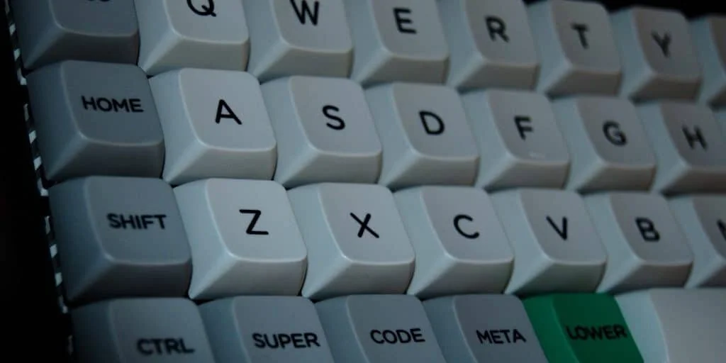
I’m doing a bit more typing now than I have lately—I’ve been reading for comprehensive exams for most of the past year, but now I’m banging on the keys more and more as I start to fill in note taking gaps. As much as I like the keyboard I have, I thought I’d poke around to see what more ergonomic options are out there, one of which is the ortholinear keyboard design, which looks like this:
Image from Mech Keybs
Unlike a standard keyboard, the keys on an ortholinear keyboard are aligned in a completely straight grid: Q is directly above A which is directly above Z. The purported advantage is that you strain your fingers less if you don’t have to stretch your fingers diagonally across the keys in order to hit the key you want. For example, let your finger rest above the “J” key right now and imagine you want to hit “Y.” There’s a marginal (but I do believe real) difference between moving your finger up and to the left to hit “Y” if your keyboard was a strict grid, versus the longer diagonal movement to hit “Y” on a standard keyboard.
This is the stretchiest keyboard move I can think of, short of getting into numbers and brackets, and while I truly don’t know if ortholinear keyboards actually stress your fingers less over time, I do see a close connection to Brazil here, and one that works the same whether ortholinear keyboards help or not.
The monitor joke of Brazil is that these people are using the least sensible method of doing something when a more sensible method is, to us, patently obvious. But if we apply the same “things could be otherwise” SF principle exemplified here to other objects around us, it starts to become apparent that even the most mundane objects could be different from the way they are. And if better options are possible for the most mundane objects, how much more complex and varied could the options be (in terms of how bad we have it and how much better it could be) for the larger systems we live and work in?
Put differently, it never hurts to step outside ourselves a bit and imagine what are the varied instances in which we are, right now, doing the same thing as the characters in this frame.


