Teaching with Technology: Classroom Spaces Online
This post is part of a series that comprise my Penn State Teaching with Technology (TWT) Portfolio. More information on TWT and links to each of these posts can be found at this hub page.
Teaching with Technology Rubric ItemS: Course Web Space, Discipline Specific Links for Students, Example of Electronic Communication with Students
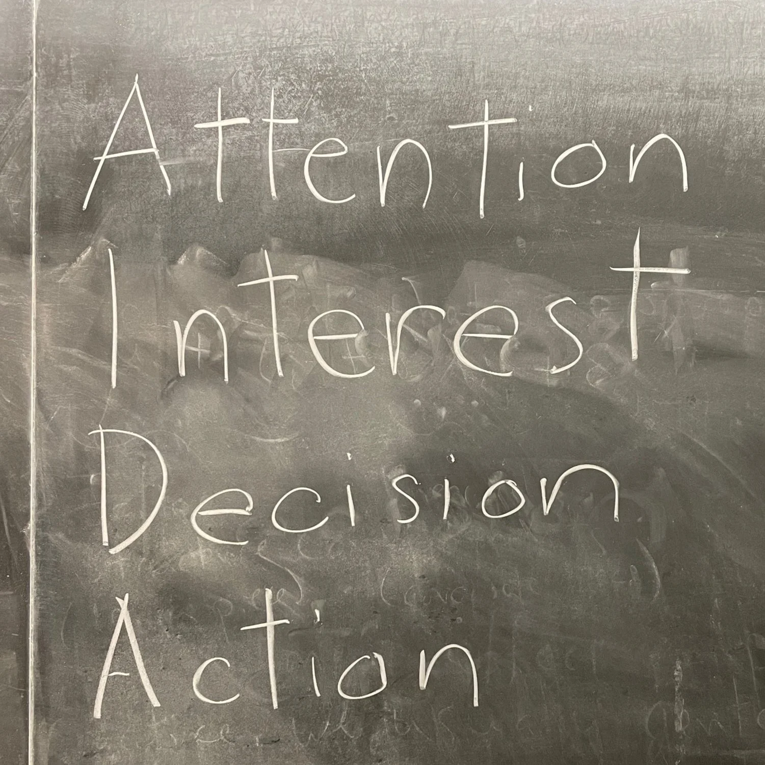
Chalkboard photo from a Business and Literature syllabus entry. Class discussion centers on a clip from the film Glengarry Glen Ross.
Course Web Space: Syllabus Site for ENGL 135: Race, Ethnicity, and Magical Realism
For a number of my previous classes, I created course sites within my professional Squarespace website. Squarespace is an easy to use tool, but as my teaching load and the demands on my time increased, I learned a valuable lesson:
Some technology solutions do not work at scale.
Creating a course website separate from the learning management system (LMS), is one of them.
I created the standalone site because I wanted some of my course design work to be publicly accessible and because I thought that having the site on the open web would be convenient for students. They could visit it without having to enter their school login credentials and complete a two-factor authentication step. I had also recognized that earlier on, I had spent far too much time fiddling with Canvas features to get my course pages to work just the way I wanted them—why put all that effort into a site that will never be seen after the course ends and will ultimately be archived (functionally, buried)? Put simply—I like to be able to control the stuff that I make and a website seemed to solve these problems.
But there are drawbacks to this approach:
It requires more maintenance. Unless I were to pay for another Squarespace site, each class required me to create its own navigation menu, which was a bit kludgy. I could create a Penn State Sites page, but some of the benefit is lost there anyway because those sites would disappear after I left the institution. This is the chief working at scale problem.
It confuses students. Students were used to logging into Canvas and finding all their syllabi and course material there. I used Canvas for accepting submissions, but despite by pointers (e.g. a Canvas home page link to the website), occasionally students would still get confused as to where to get the course information.
Should I find myself with a smaller courseload in the future, or have a compelling need to use an external website, I might try this again.
In the meantime, you could say that this is all a story of How I Learned to Stop Worrying and Love the Learning Management System.
Discipline Specific Links for Students
A sample “completed” syllabus schedule entry from Business and Literature (Spring 2022):
Mar 4 (Fri): Extra Credit In-Class Project + Unit Wrap-Up: Global Business
Watched in class: Foley, James. Glengarry Glen Ross. New Line Cinema, 1992. Excerpt: 8:30–15:34.
Mentioned: Hashemi, Mahsa. “A Few Bad Friends: Dynamics of Male Dominance and Failure of Masculine Bonding in David Mamet’s Glengarry Glen Ross.” Arcadia 55, no. 1 (June 5, 2020): 122–41.
Glengarry Glen Christmas: Elf Motivation. Saturday Night Live, 2005.
Slide: Projected prompt Chalkboard: AIDA
As we progress through the syllabus schedule, I add to each class meeting’s entry copies of presentation slides, bibliographic information for works mentioned in class, and, occasionally, photos of the chalkboards or whiteboards. This is a “living document” not in the sense of shifting deadlines for readings and assignments (there lies madness), but rather, as a repository that grows over the course of the semester. Even if I were to follow the same schedule in two subsequent semesters, the material that appears where would be different. I usually include the final “complete” syllabus in a PDF that I circulate to the class at the end of the semester.
Growing the schedule content in this way is intended to allow interested students to find relevant further reading, and to make it easy for absent students to reconstruct some of what happened during the meeting (ideally, with the help of a classmate’s notes). The latter was a particularly important consideration during peak COVID-19 periods, when long stretches of student absences were not uncommon due to illness or quarantine and isolation protocols.
Example of Electronic Communication with Students
The types of media that I use for electronic communication with students have changed over time, largely based on trial and error and determining what forms best combine effectiveness with efficiency. In my asynchronous online courses, I’ve experimented with weekly announcements that ranged from all-text, to audio recordings, to webcam recordings, to videos shot on a DSLR or that incorporated onscreen graphics.
Ultimately, I determined that for various reasons, sticking with text most of the time was best. According to my end of semester survey, a large number of students didn’t watch the videos, and a student advised (rightly, in my opinion) that an opening and closing video may be sufficient.
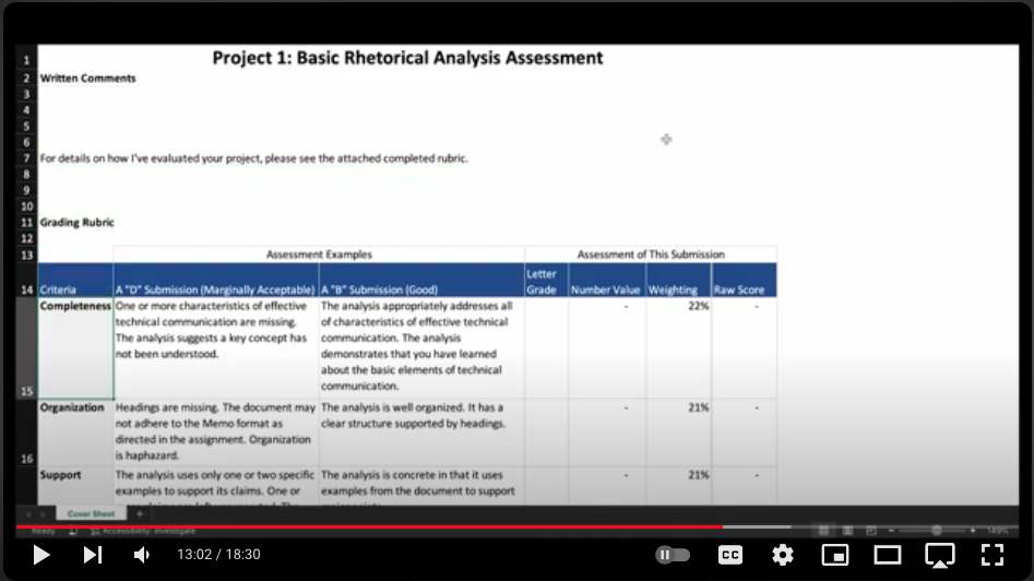
There are also some communications that are best suited for a video format. I use a fairly complex grading rubric, and a text explanation would be tedious and likely left unread. For an online technical writing course, I created a video that walked students through the rubric. To increase accessibility, and to acknowledge that some students may prefer to skim text rather than watch the whole video, I used Adobe Premiere to auto-generate a transcript. I put those captions into the video itself and attached a text file version of the transcript to the message.
Here’s the rubric walkthrough video:
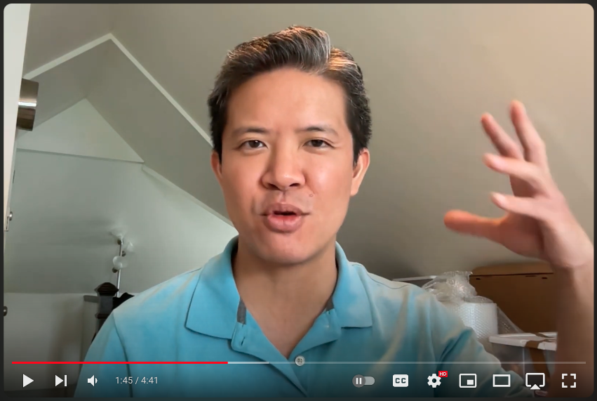
For messages that don’t require extensive visual aids, a quick video can be thrown together by simply writing the message and reading it on camera. This means that you can send the “script” as the body of the message and note that video and text contain the same information content. While burn-in closed captioning is still the ideal, this is a reasonable compromise if you don’t have time to take those steps.
Here is an example of such a message:


